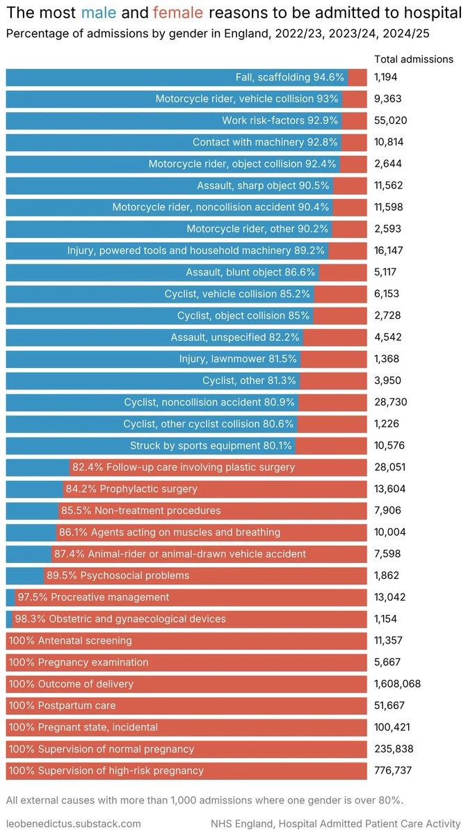
It doesn’t compare directly to the male category because there is no male category listed.
Quite a bit of interesting information on display to be sure, but with 20% of the chart displaying information that excludes one of the two things being compared, it’s not a good representation of what the title suggests.
On a chart showing male female disparity for types of cancer, ovarian and testicular would be just as irrelevant as the bottom fifth of this admissions chart.
I am a bit confused. Do you mean they purposely grouped stuff to make it seem like a bigger issue than the cancers you mention?